

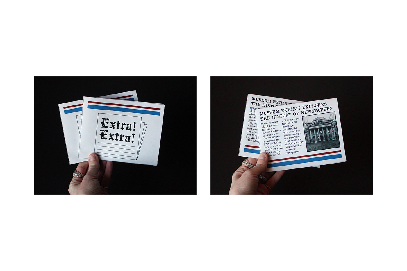

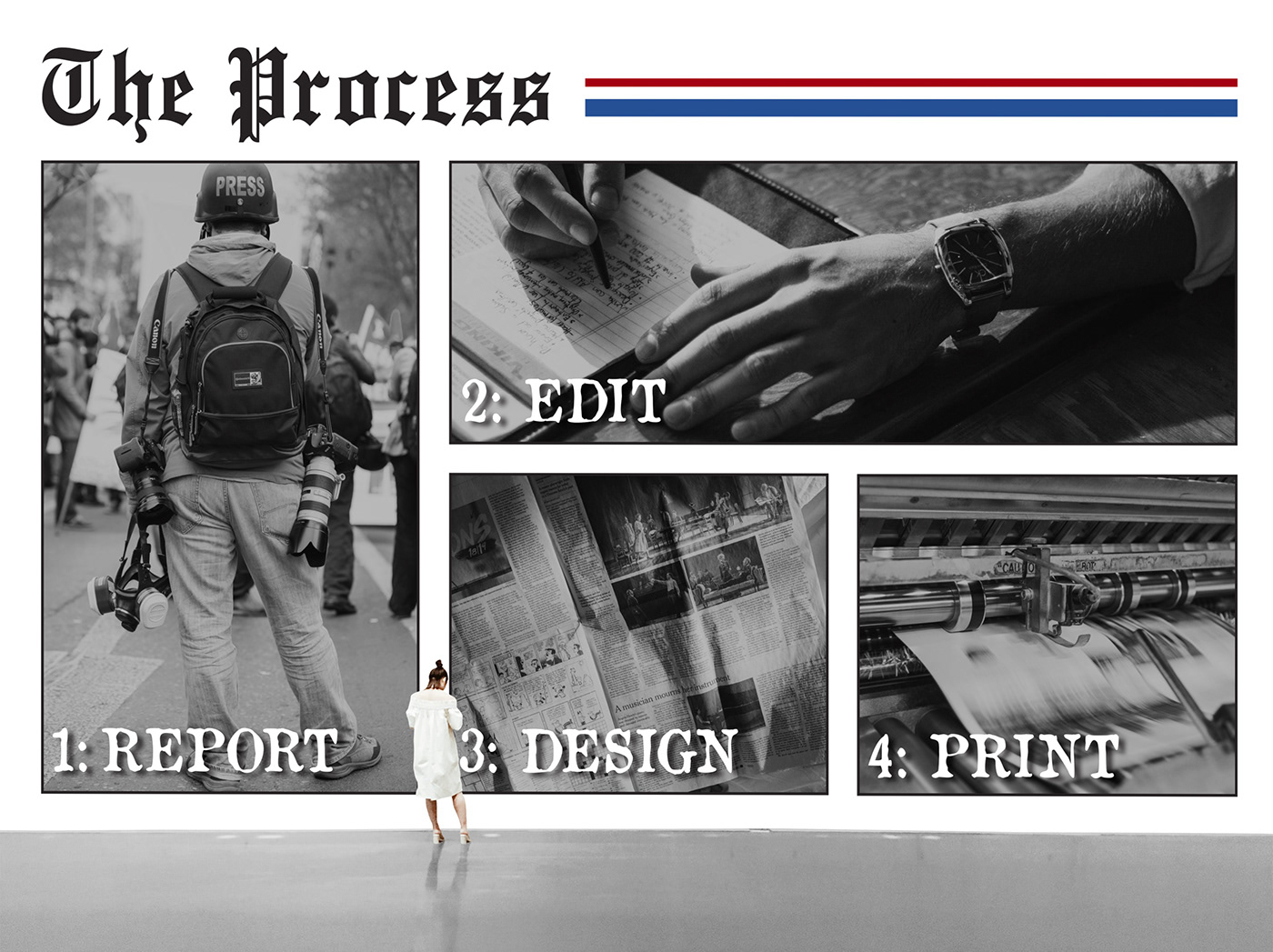

I was tasked with creating a museum exhibit. I chose to design one for the history of newspapers. I researched how they began and the various changes that created it into the industry it is today. I took my knowledge of newspaper design and used it to inspire and direct my designs. I wanted my logo to be simple but eye-catching. I used big and bold headlines as well as lines throughout my designs. I created two environmental wall designs and one narrative literature. For my narrative literature, I designed it to function as a mini newspaper. It highlights the four different areas of the exhibit. For my color palette, I chose to keep it mostly black and white because newspapers were black and white for many years. The other two colors I used were red and blue because they are generally associated with the news, and they bring thoughts of trust and loyalty.

